Via ConvergEx's Nick Colas,
The “Curse of Correlation” may have finally met its match. Ever since the Financial Crisis, most U.S. equity sector groups have traded with very tight correlations to the market as a whole. We’ve tracked this phenomenon since 2009, and average sector correlations have been +80% over that time rather than the 50% considered “Normal”.
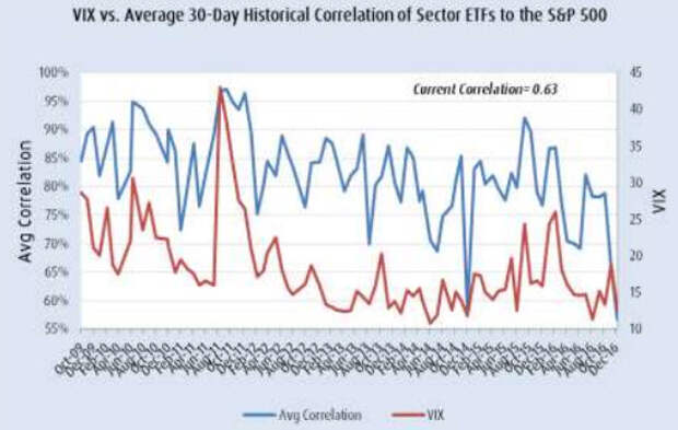
Over the past month, however, sector correlations averaged just 57%. That’s the lowest observation since we started keeping track of this indicator in October 2009. So what gives, and how long will it last? The one word explanation is “Trump”.
The President-Elect’s proposed policies break so completely with the last 8 post-Crisis years that investors are re-evaluating everything from the trajectory of long term interest rates to which sectors stand to benefit the most under a Trump presidency. As for how long this new/old “Normal” will last, just ask yourself “How predictable do I think new administration will be, especially in its first year?”
Our assumption: not very, which means correlations will remain low.

Search for “Famous curses” on Google, and you’ll find the Internet has a minor fascination with systematic and seemingly unexplained misfortune. A few examples:
- The Hope Diamond. Forty-five carats of death and destruction, including a stint as the prized jewel of Louis XVI of France until the unpleasantness known as the French Revolution came along. Other owners have reputedly been torn to pieces by mobs (France) or dogs (Constantinople). And they were the lucky ones…
- King Tut. The money man behind the 1922 unearthing of this 18th Dynasty pharaoh, Lord Carnarvon, died shortly after the discovery. As did 20 other people associated with the excavation. Lead archaeologist on the dig Howard Carter did manage to live 17 years after breaking the tomb’s seals, however.
- James Dean’s Porsche 550 Spyder. Dean died in a crash while driving it, and as it was parceled out for parts, some awful things happened to the people who took the pieces. The outer shell of the car disappeared outright and has never been found.
- Otzi the Iceman. Remember the frozen Bronze Age corpse found in the Alps back in 1991? Like King Tut, several of the teams that excavated him or did the follow up research on the body have met with untimely deaths.
Capital markets have had their own curse since the 2008 Financial Crisis: correlations between disparate asset classes and sectors have remained remarkably high. Some groups might under/overperform (tech up, financials down), but on any given day/week/month they tended to move in the same direction as the S&P 500. The “Curse of Correlation” had notched its own victims, chiefly active money managers who tried to outperform the passive indices with modest sector over/under weights. That playbook worked fine in the 1980s and 1990s, but not lately.

We have tracked the “Curse of Correlation” on a monthly basis since October 2009. The basics are simple: the average sector (tech, financials, utilities, etc) correlation to the S&P 500 has been 82.3% since we started looking at the data. Other asset classes, such as Emerging Market and EAFE (Europe, Asia, Far East) developed economy equities have been in that same low-80% range. High yield corporate bonds have shown a 70% average correlation to equities. History, experience, and common sense tell us that all these correlations to U.S. stocks should be closer to 50%. Yes, they are all financial assets, but how much should tech stocks trade like junk debt or utilities? Not as much as they have.
Now, correlations have declined dramatically:
- Average sector correlations to the S&P 500 were 56.8% over the last month, the lowest reading since we started looking at the data in 2009. The prior low of 58.4% was in December 2014. Just 2 months ago, average correlations were 79% and last month they came in at 66%. The trend is clearly our friend here.
- Correlations between non-US equities and the S&P 500 were 77.5% for the developed economies of the EAFE countries and 51.6% for the Emerging Markets. Two months ago those readings were 88.4% and 87.8%, respectively.
- Domestic high yield corporate bonds showed a 54.75% correlation to the S&P 500 over the last month. That’s well below the long run average of 70% and the 87.8% of two months ago.
- Looking at the individual sectors, all show materially lower correlations to the market as a whole over the past month. Technology is down to a 70% correlation from 92.9% two months ago. Energy stocks are less than 50% (41.4%, to be exact) correlated to the S&P 500, versus 72.4% two months ago. Even the big winner of the last month – Financials – are now just 53.2% correlated to the U.S. equity market as a whole.
It is hard to overstate how important a development this is. Lower correlations signal that investors are actively choosing winners and losers more aggressively than at any point since the Financial Crisis. If you think back a few years to the “Risk On, Risk Off” markets of 2010 – 2015, you will recall how monotonically stocks responded to macro news. Good, or bad, everything pretty much worked (or not) depending on the market’s perception of central bank interest rate policy.
Now, we have a brand new paradigm that is actually the same as the old (pre-Crisis) paradigm. Since President-Elect Donald Trump’s surprise win, investors have been hustling to identify new macro trends (higher interest rates, primarily) and unlock potential winners (financials, industrials, materials, and health care, for the most part). And since most investors don’t have a lot of money on the sidelines, they are expressing these views by selling losers (tech and utilities) to buy the new market leadership.
For those with a nostalgic bent and/or a lot of miles on the clock, this will all look pretty familiar. It is 1991 – 1996 all over again – a typical cyclical rally, but now caused by anticipated fiscal policy rather than a Fed rate cycle. And for those without that historical perspective, it just looks like a lot of performance chasing into the end of the year.
As for whether the old dogs or the young pups will end up right is up for grabs at the moment. All the correlation data simply tells us is that this time (post-election) is actually different from any point since the Financial Crisis. The “Curse of Correlation” has lifted, for now. If it really is a new day, we shouldn’t see correlations return to their post-Crisis highs for many years. One month, however good, is not enough time to know for sure. But you have to start somewhere, even in the curse-breaking business.